If your project data lives in a list, you already know the feeling:
- You can see the items…
- …but you can’t easily answer questions about them.
Questions like:
- “How many tasks are stuck in Review for each person?”
- “Which clients generate the most support tickets?”
- “What’s changed month-over-month?”
- “Where’s the workload actually going?”
A pivot table is how you turn a long list of records into a clear summary you can actually use.
No magic. No maths degree. Just a simple way to group data and calculate totals.
A pivot table, in one sentence
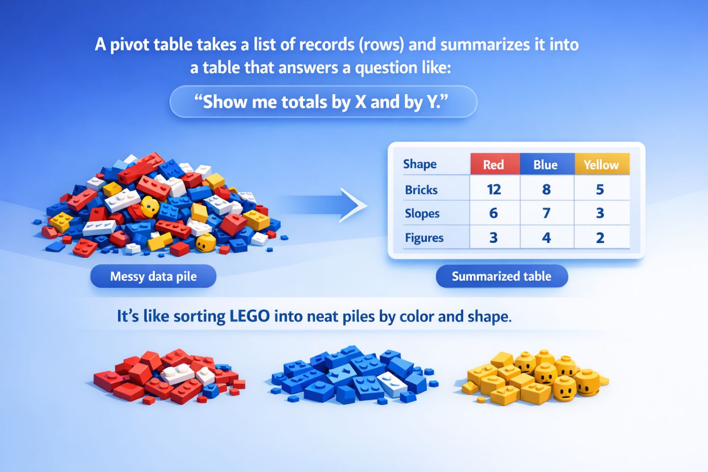
A pivot table takes a list of records (rows) and summarises it into a table that answers a question like:
“Show me totals by X and by Y.”
Think of it like taking a messy pile of LEGO and sorting it into neat piles by colour and shape, so you can see what you actually have.
The problem pivots solve
Most project tools store data in a “flat” format:
Each row is one thing (a task, ticket, deal, invoice, etc.), and each column is a field (assignee, status, priority, date, hours, cost, client).
That’s great for storing data, but not great for analysis.
A pivot is what you use when you want to stop scrolling and start answering.
A tiny example (you can picture this)
Imagine a simple task list like this:
| Task |
Assignee |
Status |
Priority |
Estimate (hrs) |
| Fix login bug |
Sam |
In Progress |
High |
3 |
| Update docs |
Priya |
Done |
Low |
1 |
| QA release |
Sam |
Review |
Medium |
2 |
| Client change |
Alex |
In Progress |
High |
5 |
From that list, you might want to answer:
Question: “How many tasks are in each status, per person?”
A pivot turns the list into a summary like:
| Assignee \ Status |
In Progress |
Review |
Done |
| Sam |
1 |
1 |
0 |
| Priya |
0 |
0 |
1 |
| Alex |
1 |
0 |
0 |
That’s the “pivot moment”: same data, just rearranged into answers.
The three pivot building blocks (Rows, Columns, Values)
Nearly every pivot tool uses the same three ingredients:
1) Rows = “Group by this”
Rows are the main categories down the left side.
Examples:
- Assignee
- Client
- Team
- Status
2) Columns = “Also group by this”
Columns split your rows into a second dimension across the top.
Examples:
- Status
- Priority
- Month
- Type
3) Values = “What should we calculate?”
Values are the numbers inside the pivot: counts, sums, averages, etc.
Examples:
- Count of tasks
- Sum of estimate hours
- Average cycle time
- Total revenue
If you remember one thing, make it this:
Rows + Columns = how you slice the data
Values = what you measure
Why it’s called a “pivot”
Because you’re “pivoting” the same dataset to look at it from different angles.
Today you might need:
- Tasks by Assignee and Status
Tomorrow:
- Bugs by Severity and Component
Next week:
- Revenue by Month and Plan
Same data. Different view. Different decisions.
What pivots are great for (real project use cases)
Here are the most common “aha” moments pivots unlock:
Workload & ownership
- “Who has the most items in progress?”
- “Is work evenly distributed across the team?”
Bottlenecks & stuck work
- “Which status is piling up?”
- “Where do tasks spend the most time?”
Trends over time
- “Are we shipping more or less than last month?”
- “Is support volume rising?”
Comparing categories
- “Which client accounts for most issues?”
- “What types of work consume the most effort?”
If you’ve ever exported data just to count and group it… that’s a pivot-shaped problem.
What pivots are not for
Pivots aren’t the answer to everything. They’re best when:
- You have repeated categories (status, owner, type, etc.)
- You want totals, comparisons, and breakdowns
- You’re happy with a summary first, details second
They’re less helpful when:
- You need to read or edit individual records (use the list/table view)
- Your data has no meaningful categories to group by
- You’re doing complex modelling (that’s a different tool/job)
The “beginner pivot recipe”
If you’ve never built a pivot before, this is a safe starting combo:
- Rows: a “who” or “what” field (Assignee / Client / Team)
- Columns: a “stage” field (Status / Priority)
- Values: Count (how many items)
That gets you a useful answer almost every time.
Then you can level up:
- Add another value (e.g., Sum of hours)
- Add another row field (e.g., Team → Assignee)
- Swap columns (Priority instead of Status)
How this looks in Gridfox (high level)
In Gridfox, Pivot View is designed to make this kind of analysis feel natural:
- You choose your row fields, column fields, and value fields
- You can adjust settings like totals, compact view, heatmaps, and charts
- And when you want to know “what’s inside” a number, you can drill down to the underlying records
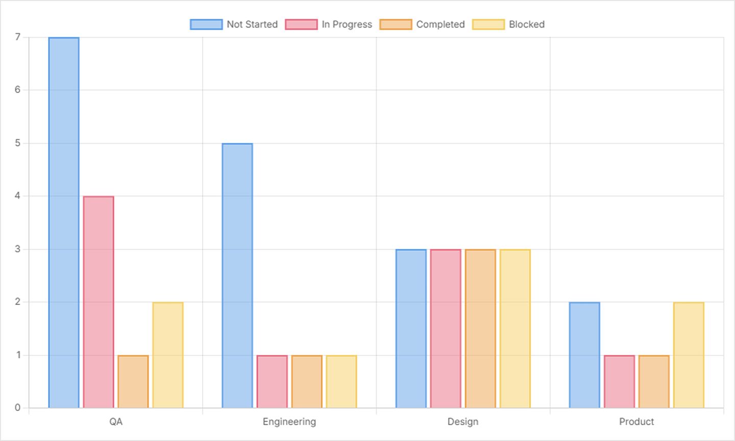
Here’s an example of a Gridfox Grid View (A table of records)
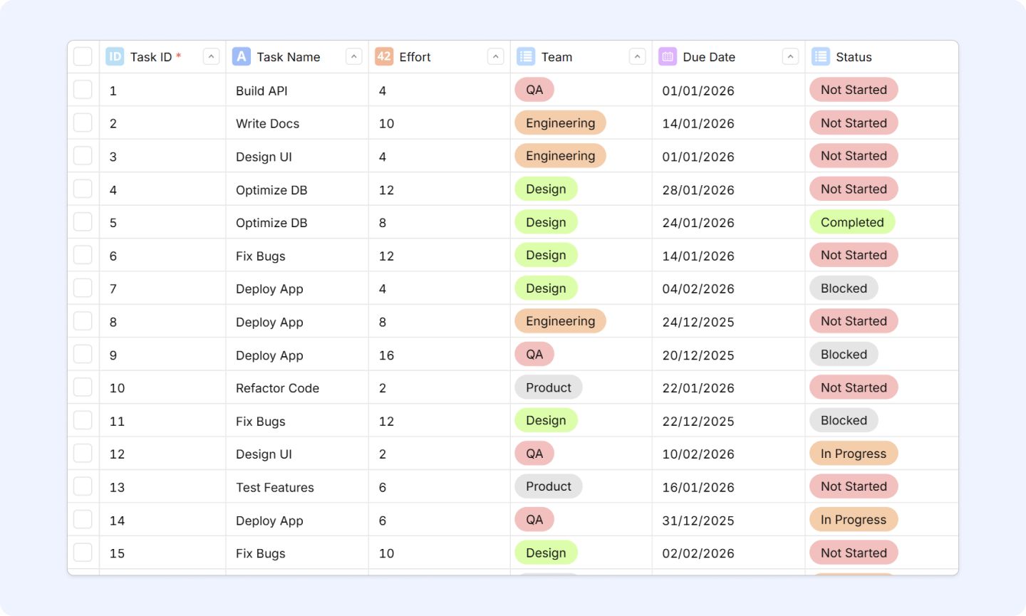
We’ll configure our pivot with the following:
- Row Fields: Team (List Field)
- Column Fields: Status (List Field)
- Value Fields: Task ID (Auto Counter)
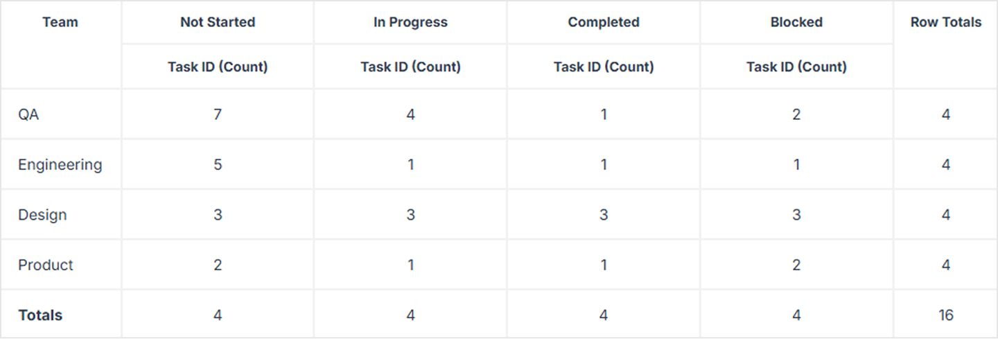
And we can enable charts to view alongside our pivot table
(We’ll walk through the exact steps in the next post.)
A quick glossary (so the jargon stops being scary)
- Dimension: a category you group by (Assignee, Status, Month)
- Measure: a number you calculate (Count, Sum, Average)
- Aggregation: the type of calculation (count/sum/avg/min/max)
- Bucketization: grouping continuous data into ranges (months, weeks, 0–5 days, 6–10 days, etc.)
Try this right now
Pick one question about your project that starts with:
- “How many…”
- “How much…”
- “Which is most…”
- “What changed over time…”
That question is probably one pivot away from being answered.
Next up: we’ll build your first Pivot View step-by-step and show a few “ready-to-copy” pivot setups you can use immediately.