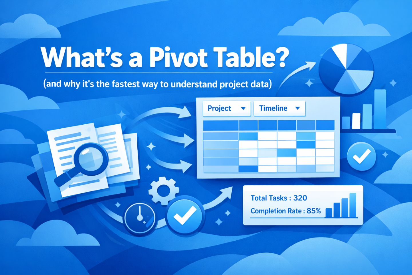
If you’ve never built a pivot before, this is the easiest way to get your first “aha” moment:
You’ll start with a list of records… and end with a clean summary that answers a real question.
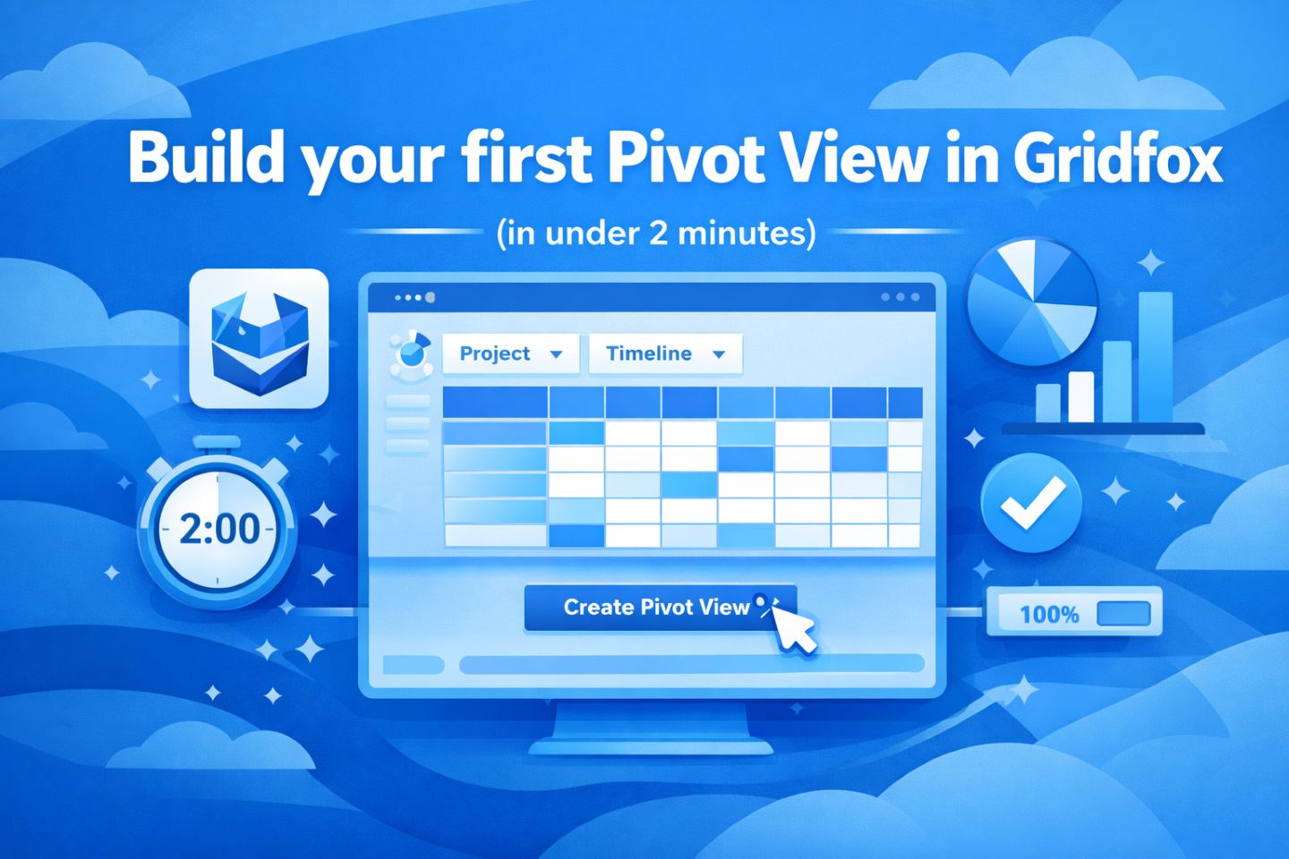
In this post, we’ll build a Pivot View in Gridfox and then quickly upgrade it with totals, charts, and drilldowns.
What we’re building (the beginner-friendly pivot)
We’ll answer a classic project question:
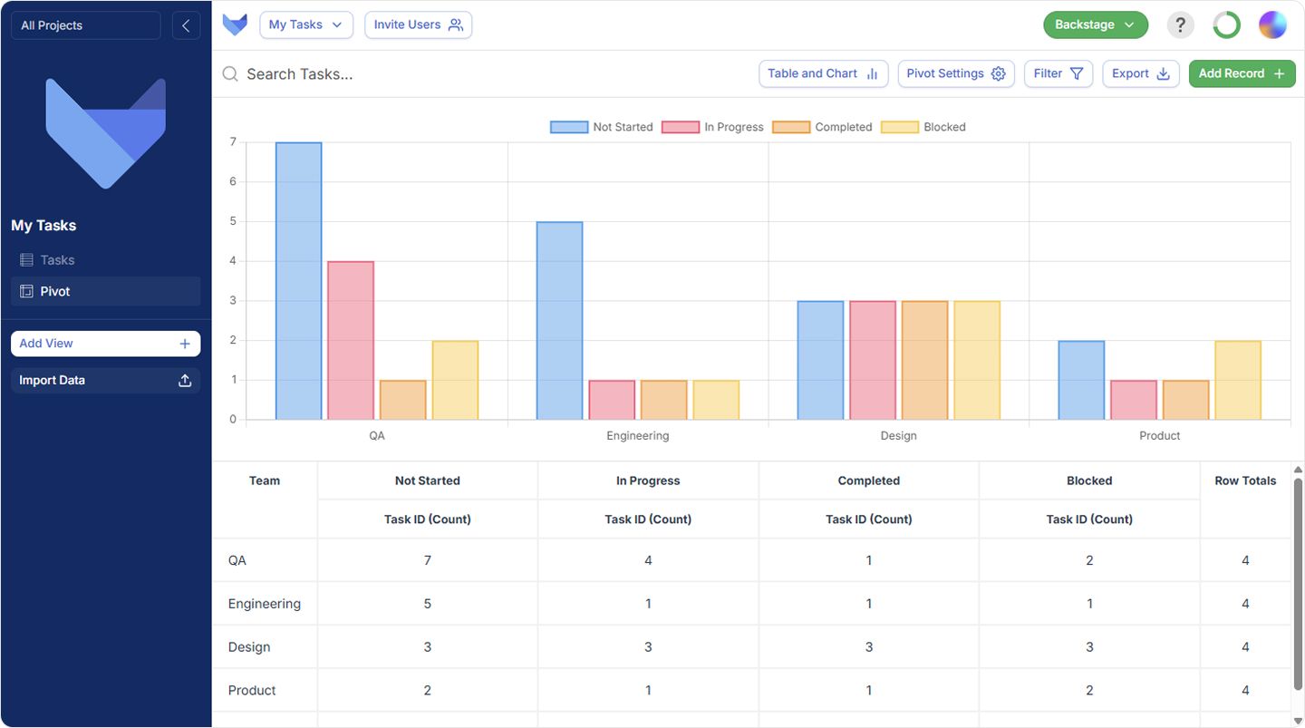
“How many items are in each Status, for each Team?”
That means:
- Rows: Team
- Columns: Status
- Values: Count of items (we’ll use an ID/counter field)
Step 1: Open your project
- In Gridfox, navigate to the project you want to analyse.
- Go to the Grid/Table view where your records live (Tasks, Tickets, etc.).
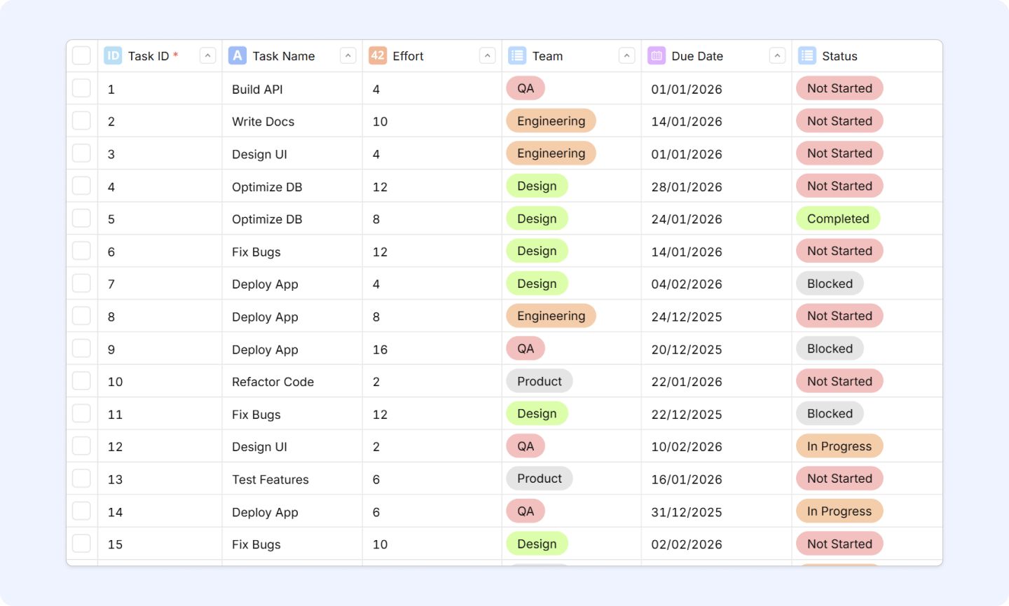
Tip: Pivots work best when your data has repeated categories like Status, Assignee, Client, Team, Priority.
Step 2: Add a Pivot View
- In the sidebar, click Add View
- Click Pivot
- Click Next
You’ll land on Pivot View Setup.
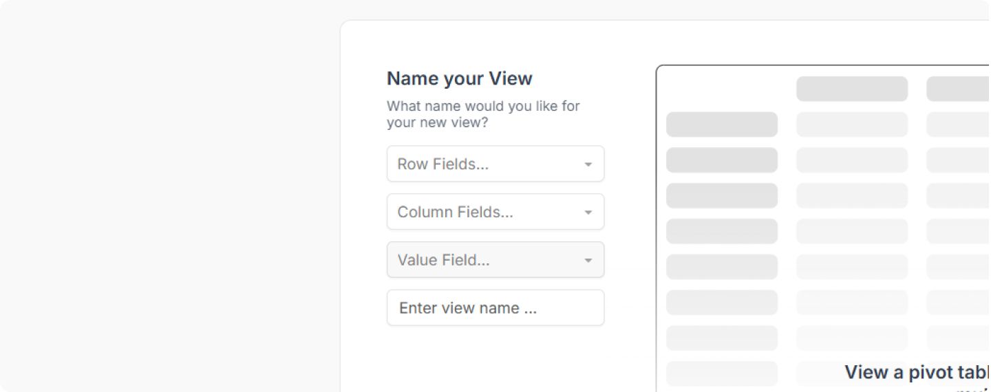
Step 3: Choose your required fields (Rows, Columns, Values)
This screen is the pivot “builder”. You can set:
- Multiple row fields
- Multiple column fields
- Multiple value fields
For our first pivot, you’re fields may differ but we’ll use the following for this demo:
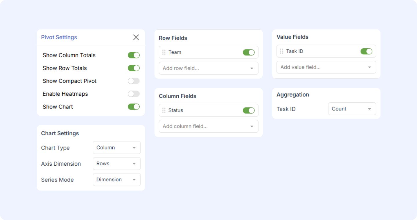
- Row Fields: Team (List field)
- Column Fields: Status (List field)
- Value Fields: Task ID (Auto Counter) → aggregated as Count
View name is optional, click Next.

If you don’t have a “Team” field, swap it for Assigned To (it works just as well).
Step 4: Meet your Pivot View
After clicking Next, you’ll see your initial pivot view.
At the top of the view (in the navbar), you’ll see Pivot Settings.
Click it.
Pivot Settings opens on the right-hand side. Here are the quick upgrades that matter most.
Totals (high signal, low effort)
- Show column totals → adds totals for each column
- Show row totals → adds totals for each row
These two toggles alone often turn a “nice table” into a decision-making tool.
Compact mode (for heavy pivots)
- Show compact pivot reduces padding so large pivots are easier to scan (and easier to fit on screen).
Heatmaps (spot patterns fast)
- Enable heatmaps helps you instantly see “hot spots” (big numbers) and “cold spots” (small numbers).
Step 6: (Optional) Turn the pivot into a chart
In Pivot Settings, toggle:
Now you’ll see chart controls:
- Chart type: Column / Bar / Line / Stacked bar
- Axis dimension: Rows or Columns
- Series mode: Dimension or Value field
A simple starting combo that works for most teams:
- Chart type: Column
- Axis dimension: Rows
- Series mode: Dimension
Step 7: Edit fields (and add more power without rebuilding)
In Pivot Settings you can edit:
- Row fields
- Column fields
- Value fields
This is where pivots become addictive: you can “pivot the pivot” without starting over.
Try these upgrades:
- Add a second row field: Team → Assignee
- Add a second value field: Estimate (hrs) as Sum
- Swap columns: Priority instead of Status
Step 8: Bucketization (when you choose a date or number)
When you select a numeric or date field, Bucketization appears.
- Gridfox will automatically set buckets based on your data
- You can customise buckets to match how your team thinks (weeks, months, ranges, etc.)
Examples:
- Dates → by week or month
- Cycle time → 0–2 days, 3–7 days, 8–14 days, 15+ days
- Cost → £0–£500, £500–£2k, £2k+
Step 9: Aggregations (what your value fields actually mean)
Each value field has aggregation settings (e.g. Count, Sum, Average).
Common choices:
- Count of items (best for volume/workload)
- Sum of hours/cost (best for effort/spend)
- Average cycle time (best for performance)
If your pivot “looks wrong”, it’s usually because the aggregation isn’t what you expected.
Step 10: Drill down (the best part)
A summary is useful — but being able to click into the exact records is what makes pivots actionable.
From the chart
- Hover over a chart element → the relevant row/column is highlighted in the pivot table
- Click the element → a drilldown appears
From the table
- Right-click a pivot cell → Drill down
-
You can also:
- Copy cell value
- Export pivot
This turns “we have 14 stuck items” into “here are the 14 items — let’s fix them.”
Filtering: keep the pivot focused
Pivot View supports the same filtering you can use across other view types.
That means you can:
- filter out noise (archived, cancelled, irrelevant teams)
- focus on one client/team/status
- analyse “just last month” or “just this quarter”
3 ready-to-copy pivot setups (for your first week)
If you want instant wins, try one of these:
Workload
- Rows: Assignee
- Columns: Status
- Values: Count of items
Priority pressure
- Rows: Team
- Columns: Priority
- Values: Count of items
Trend
- Rows: Month (bucketized date)
- Columns: Status (optional)
- Values: Count of items or Sum of hours
What’s next
You’ve built a Pivot View, upgraded it with totals + charts, and learned how to drill down to the underlying records.
Next up: we’ll share a handful of “pivot questions” you can copy (and the exact setups that answer them), so you can get value even if you’ve never done analysis before.