If you manage projects using a simple list of tasks, you’ve probably experienced the “phantom bottleneck.”
It looks like this:
- You have a list of 10 tasks.
- Everyone says “Understood.”
- …and then suddenly, three weeks later, you realize four of those tasks need to happen on the exact same day, by the exact same person.
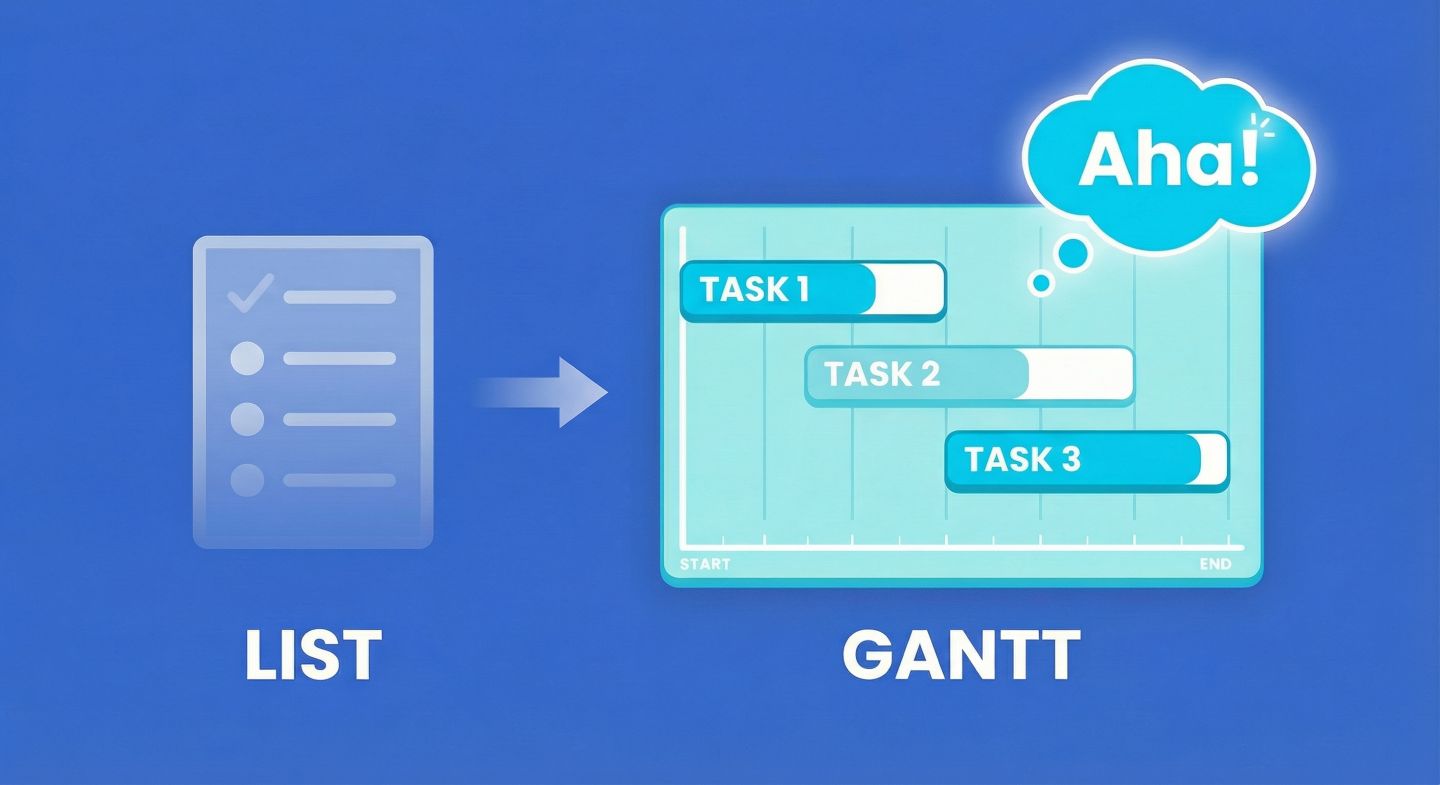
Lists are great for telling you what to do.
They are terrible at telling you when it fits.
A Gantt chart is how you stop guessing and start scheduling. It takes a static list of “to-dos” and spreads them out across a timeline so you can spot reality before the deadline hits.
A Gantt chart, in one sentence
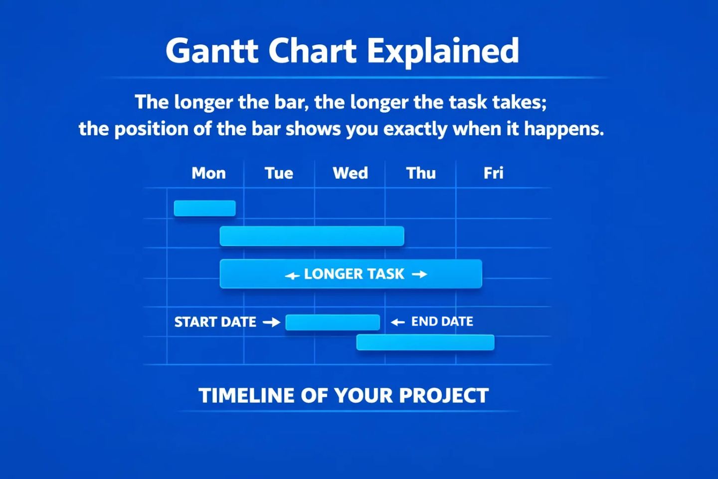
A Gantt chart visualises your project schedule by turning tasks into horizontal bars:
“The longer the bar, the longer the task takes; the position of the bar shows you exactly when it happens.”
Think of it like a calendar, but instead of just showing meetings, it shows the lifespan of every piece of work on your plate.
The problem Gantt views solve
Most project data starts in a table:
| Task |
Start Date |
End Date |
Owner |
| Write Code |
01/02/26 |
05/02/26 |
Sam |
| Test Code |
04/02/26 |
06/02/26 |
Sam |
If you look closely at that table, you might spot a problem. Sam is supposed to start testing the code before he finishes writing it.
In a list, that conflict is just two dates hiding in a grid of numbers. You have to do mental maths to find it.
In a Gantt View, that conflict screams at you. You would instantly see two bars overlapping for Sam, showing a physical impossibility.
Lists hide time. Gantt charts reveal it.
The four building blocks of a Gantt
While they can look complex, every Gantt chart is built from the same four simple ingredients:
1) The Timeline (The X-Axis)
Across the top runs your time. This could be days, weeks, months, or quarters. This is your “playing field.”
2) The Bars (The Tasks)
Every task is a horizontal bar.
- The left edge is the Start Date.
- The right edge is the End Date.
- The length is the Duration.
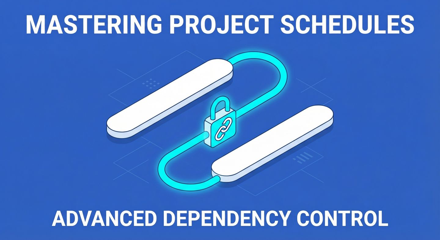
3) The Dependencies (The Lines)
These are the arrows connecting the bars. They tell the story of the workflow. An arrow pointing from Task A to Task B says: “You cannot start B until A is finished.”
4) The Milestones (The Diamonds)
These are zero-day events. They aren’t work; they are finish lines. Examples include “Project Sign-off” or “Beta Launch.”
Why it’s called a “Gantt”
It’s named after Henry Gantt, an engineer who popularised this way of visualising work in the 1910s (originally for factories and infrastructure).
While technology has changed—we aren’t drawing these on paper anymore—the core principle remains: visualising time is the only way to manage it.
What Gantt Views are great for (real use cases)
Here is why project managers eventually graduate from spreadsheets to Gantt views:
Reality Checks
“We said this project would take 2 weeks, but when we drag the bars out, it physically takes 4 weeks.”
Resource Management
“Why is Sarah assigned to 5 active bars in the same week? We need to move these.”
Dependency Management
“We can’t paint the walls until the plaster is dry.”
If the plastering takes 2 extra days, a Gantt chart with dependencies will automatically push the painting task back 2 days. (We’ll cover how Gridfox handles these “Strict” vs “Flexible” moves in a later post).
Client Communication
Sending a client a list of dates is confusing. Showing them a picture of the timeline makes them understand why the launch date is set for March.
What Gantt Views are not for
Gantt charts are powerful, but they aren’t for everything.
- Brainstorming: Don’t use a Gantt to capture ideas. Use a list or a Kanban board. Gantt charts need dates.
- Micro-tasks: If a task takes 10 minutes (e.g., “Email Bob”), it doesn’t need a bar on a chart.
- Agile Backlogs: If you don’t know when work will happen yet, keep it in a backlog list. Only move it to the Gantt when you are ready to commit to a timeline.
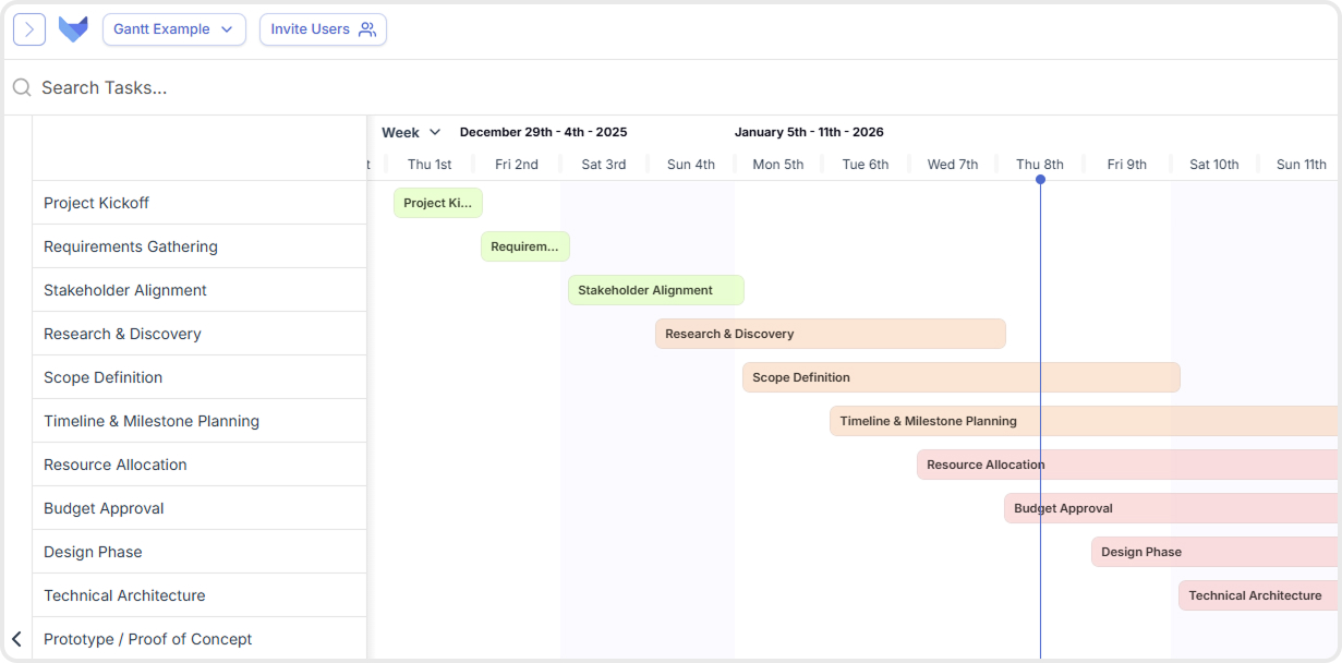
How this looks in Gridfox (high level)
In Gridfox, a Gantt View isn’t a separate island, it’s just another way to look at your existing data.
If you have a Table of tasks with a Start Date and an End Date, you are one click away from a Gantt chart.
- You select your date fields.
- Gridfox draws the timeline.
- You can colour-code bars by Status (Green for Done, Red for Blocked).
- You can tick things off directly on the timeline using a “Completed” checkbox.
(We’ll walk through the exact setup steps in the next post.)
A quick glossary
- Predecessor: The task that must happen first.
- Successor: The task that waits for the first one to finish.
- Lag: A planned delay (e.g., “Wait 2 days for paint to dry”).
- Critical Path: The sequence of tasks that, if delayed, delays the whole project.
Try this mental exercise
Look at your current project list. Pick three tasks that are related.
Ask yourself:
- Which one must finish before the others start?
- If the first one is late by 3 days, do you know the new finish date for the last one?
If you can’t answer that instantly, you need a Gantt view.
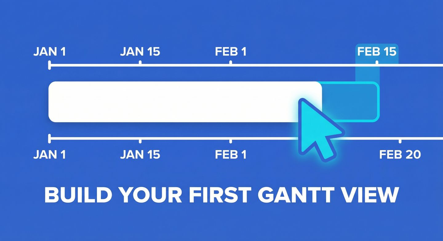
Next up: We’ll show you how to build your first Gantt View in Gridfox in under 2 minutes—including how to add those handy status colours and assignees.