An Introduction to Dashboards
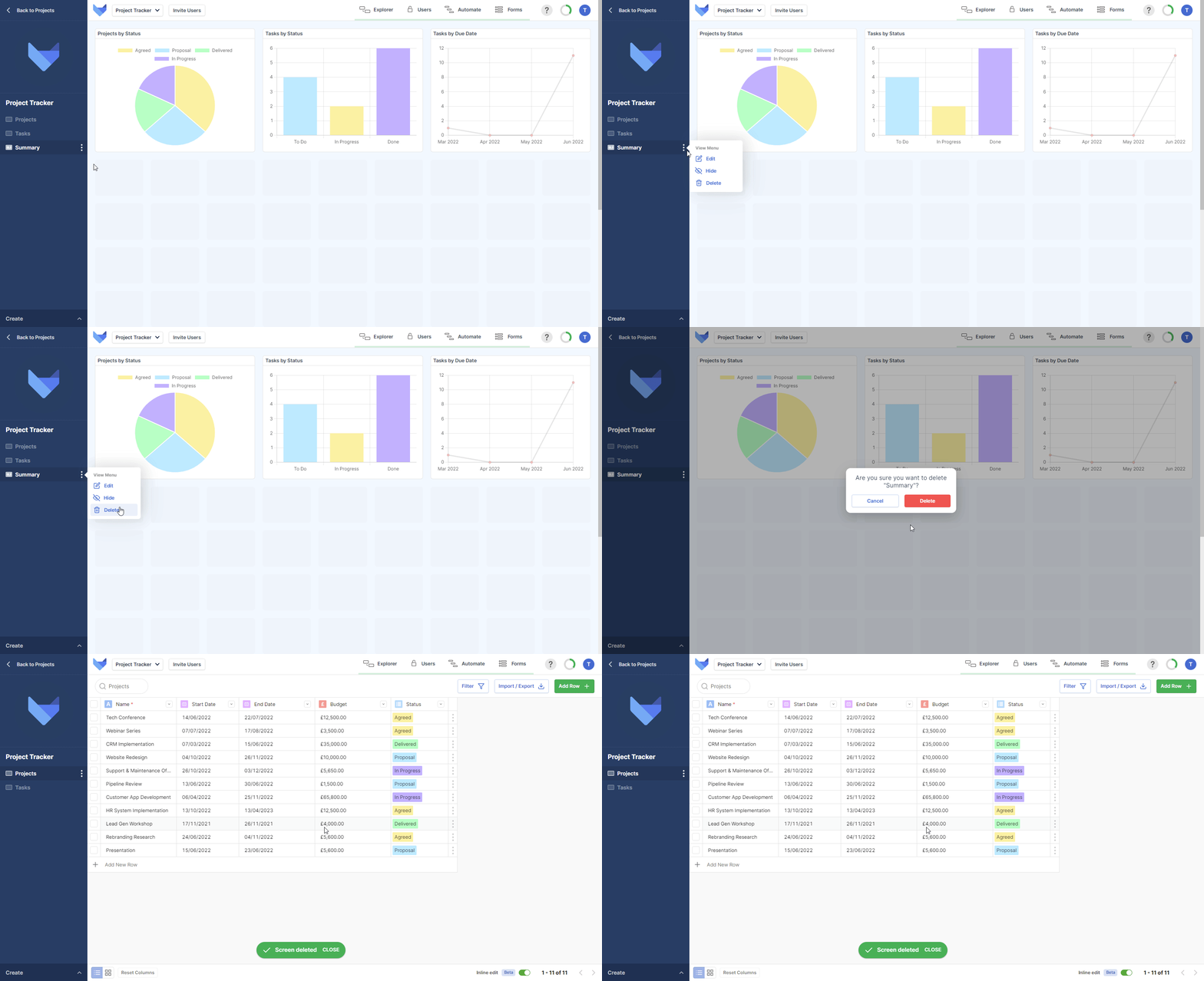
In your Gridfox Project you can create Dashboard Views to help your Users visualise and understand the Project data across multiple Tables. Dashboards are made up of different chart components such as pie charts and bar charts. If a User doesn’t have permissions to see a data in one of the Dashboard Charts then the Chart will be hidden from them.
Dashboards that you create will appear in the left hand navigation sidebar for your Users to see, along with all other Views.
Creating Dashboards
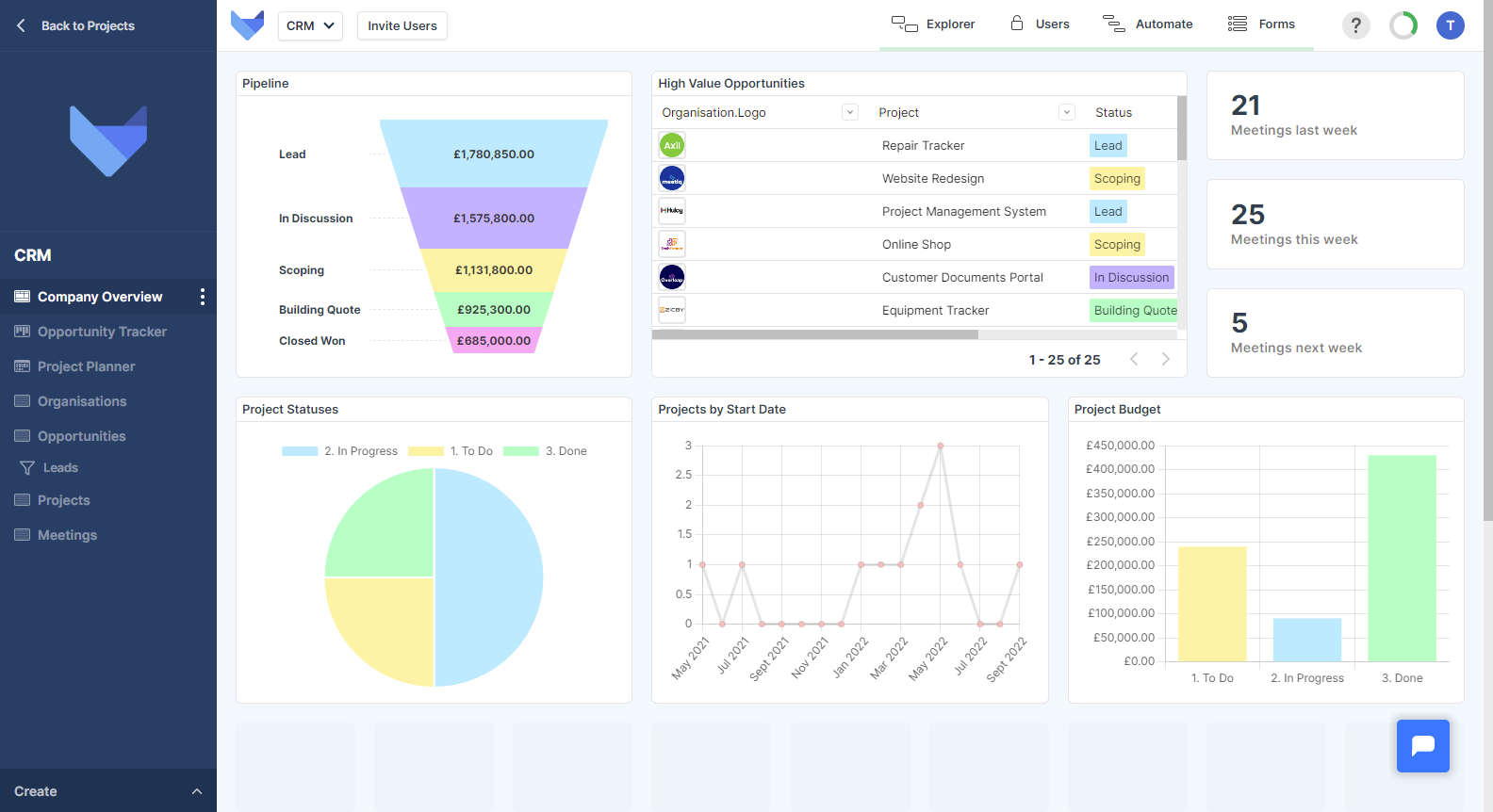
To create a Dashboard in your Project, add a new Dashboard View and then configure the Charts that you wish to show on the Dashboard. You can customise and configure the layout of your Dashboard, moving Charts and resizing them.
Creating a new Dashboard View
- Open the Create menu in the bottom left hand corner
- Click Dashboard
- Enter a name for your Dashboard View
- Click the next arrow
This will take you to the Dashboard canvas where you can start adding Charts to the Dashboard.
Adding Charts to a Dashboard
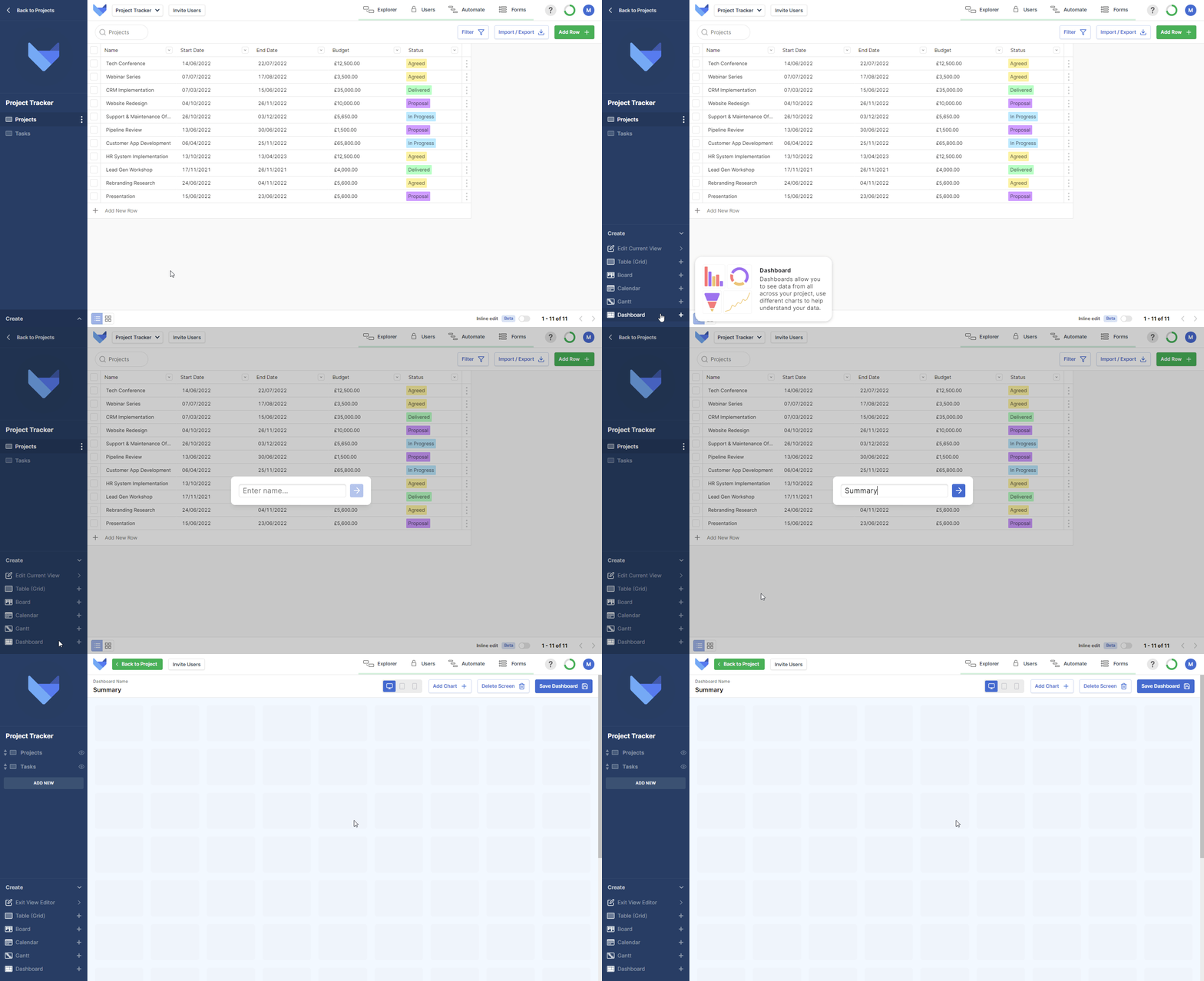
There are several different Chart Types each with their own configuration and settings but each Chart is added in the same way.
- Click Add Chart in the top right hand corner
- Choose the type of Chart you want
- Complete the configuration steps for your chosen Chart
- Click Save Chart
Repeat these steps until you have added all the Charts that you need.
Resizing Charts
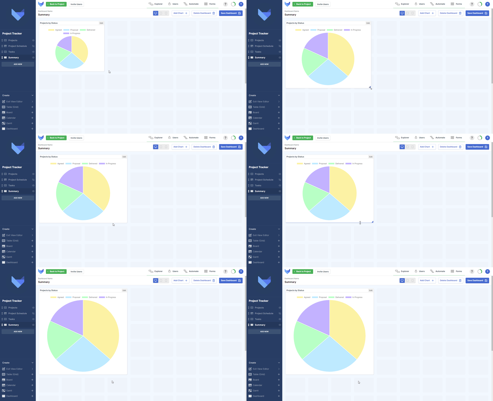
You can customise the layout of your Dashboard by resizing the Charts. Click and drag the corner of a Chart to adjust its size.
Moving Charts
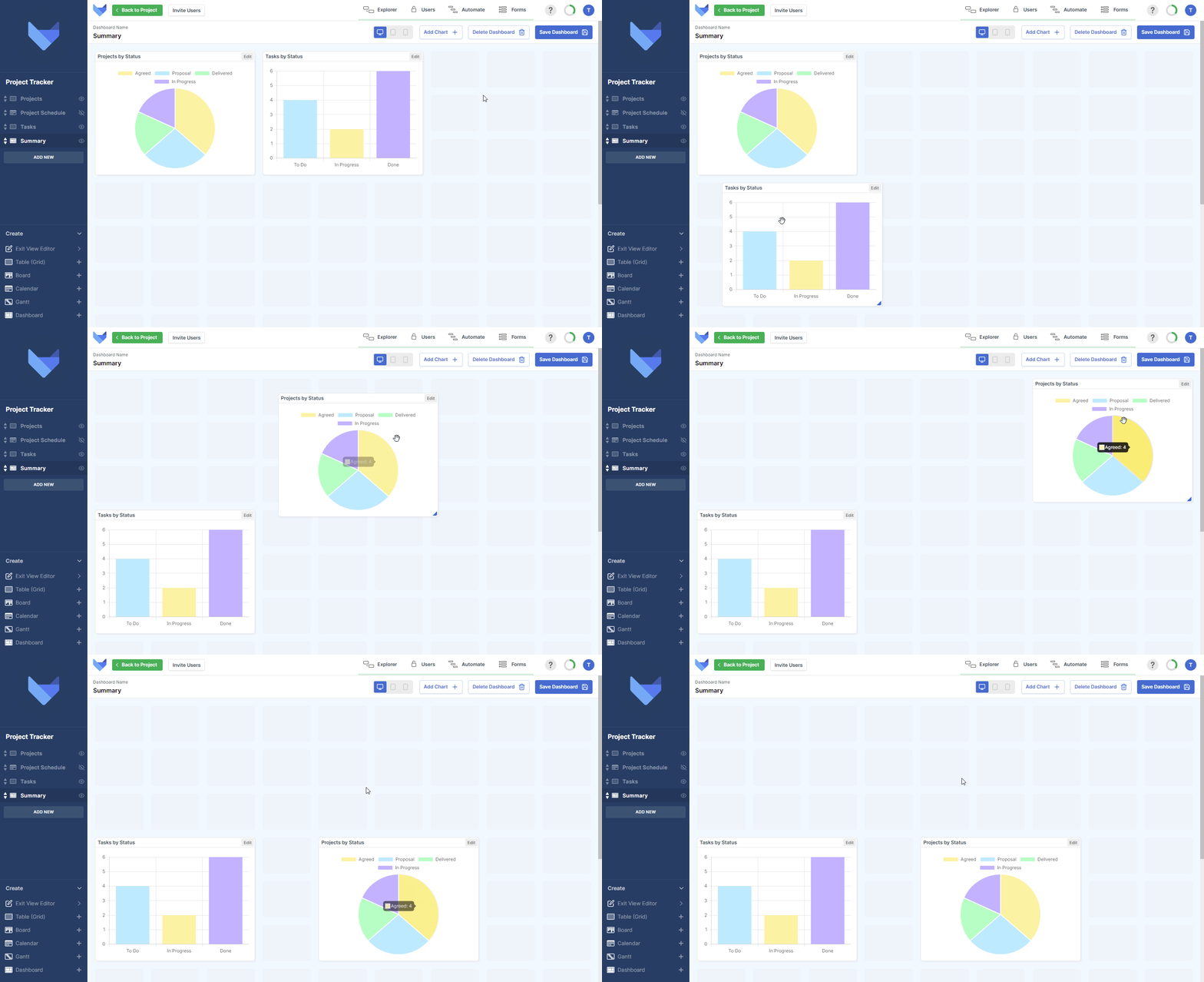
Charts can be moved around the Dashboard by dragging and dropping them on the canvas. Note that Charts are not allowed to overlap.
Previewing a Dashboard
You can preview how your Dashboard will look for Users on different devices by toggling the device menu in the top right hand corner. You can only add Charts and amend the Dashboard layout whilst in the desktop view. Chart settings can be configured in all views.

Removing a Chart from a Dashboard
If a Chart is no longer needed on the Dashboard, it can be removed when you are configuring your Dashboard.
- Click Edit in the top right hand corner of the Chart that you would like to remove
- Click Delete Chart
- Click Delete
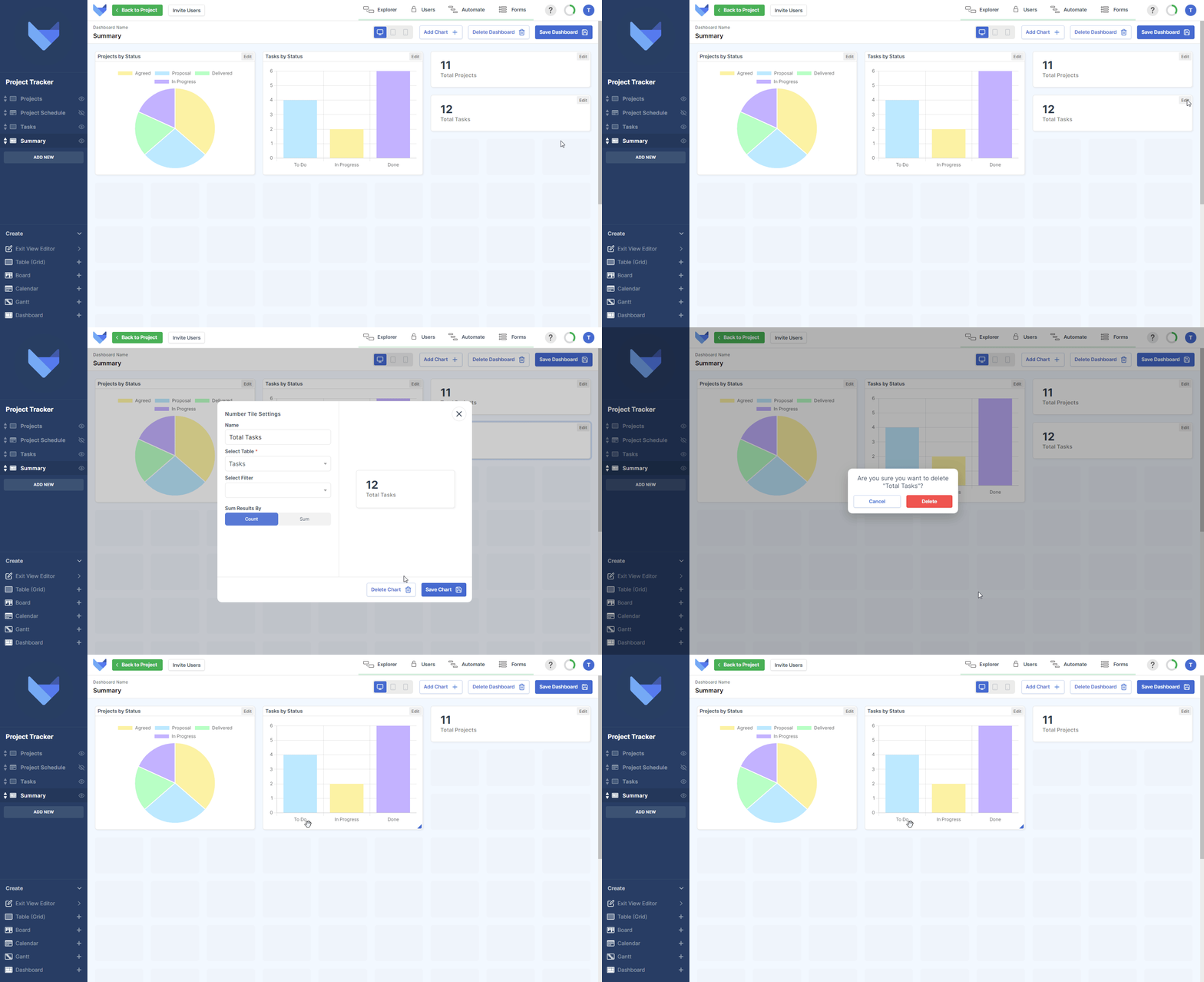
Chart Types
There are six different types of Chart that can be added to your Dashboard, each with their own configuration and settings.
Pie Charts
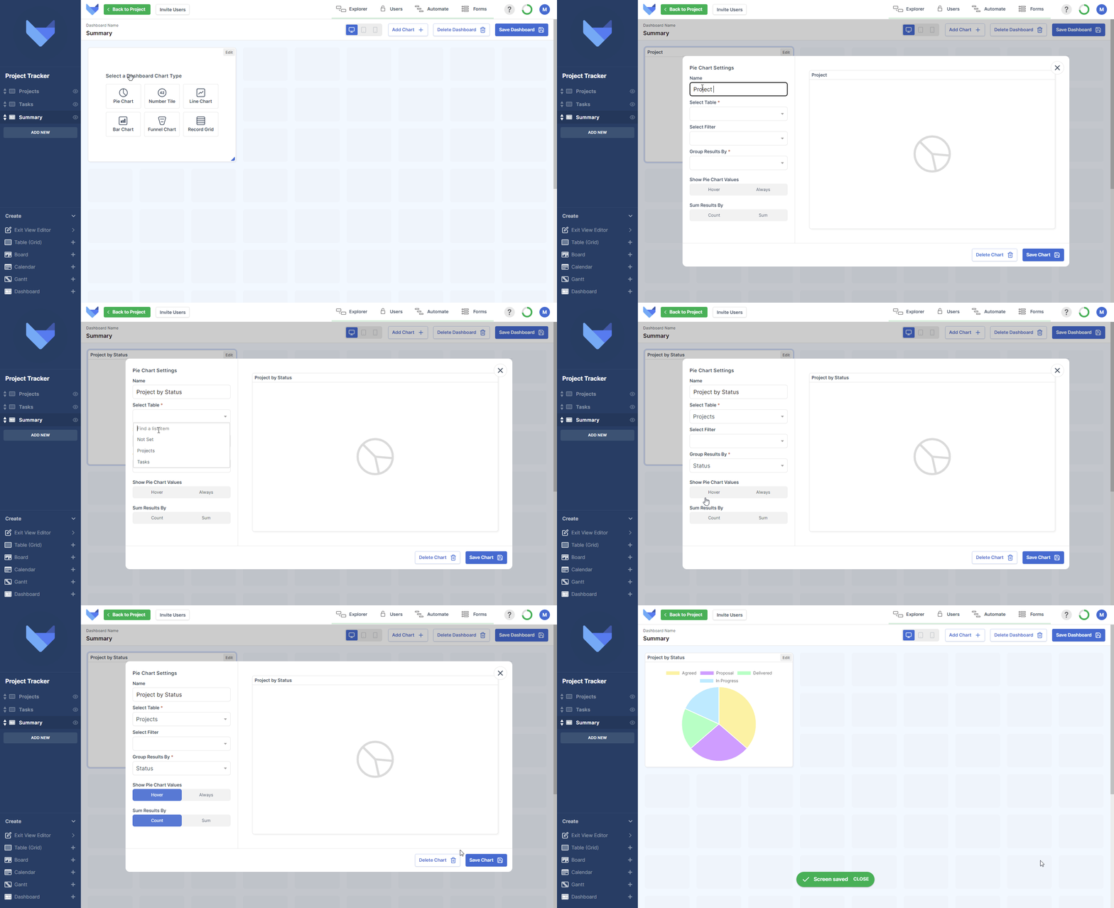
Pie Charts can be used to segment data into categories. The proportion of data in each segment can be seen at a glance.
- Enter a Name for the Chart
- Choose which Table the Pie Chart should show data from
- Optionally, select a Saved Filter to show a subset of data on the Chart
- Choose which Field to Group the data by, where the Field Type must be a List, Date, Date Time, User, User Group or linked Parent
-
In ‘Show Pie Chart Values’, choose how segment values should be displayed
- Hover: The segment values are shown when a user hovers their mouse over that segment of the Chart
- Always: The segment values will be shown at all times when the Pie Chart is viewed
-
In ‘Sum Results By’, choose how to calculate the value of each segment
- Count: Number of Records that match the grouping
- Sum: Total value in a chosen Field for all Records that match the grouping, where the Field chosen is a Number, Money or Formula Field
- Click Save Chart
Number Tiles
Number Tiles display a single number based on the count of Records in a Table or the total sum of a Field on Records in a Table.
- Enter a Name for the Number Tile
- Choose which Table the Number Tile should show data from
- Optionally, select a Saved Filter to show a subset of data on the Chart
-
In ‘Sum Results By’, choose how to calculate the value shown on the Number Tile
- Count: The number of Record in the selected Table that match the filter, if one has been selected
-
Sum: Total value in a chosen Field for all Records in the selected Table that match the filter, if one has been selected
With this option you must choose a Field of Type Money, Number of Formula to sum by
- Click Save Chart

Line Charts
Line Charts display data across two axes.
- Enter a Name for the Chart
- Choose which Table the Chart should show data from
- Optionally, select a Saved Filter to show a subset of data on the Chart
- Choose which Field you would like to Group data by on the x-axis of the Chart, where the Field Type must be a List, Date, Date Time, User, User Group or linked Parent
-
Finally, choose how the value of each point is determined in the ‘Sum Results By’ section, where you can choose to from one of the following options:
- Count: Number of Records that match the grouping
- Sum: Total value in a chosen Field for all Records that match the grouping, where the Field chosen is a Number, Money or Formula Field
- Click Save Chart

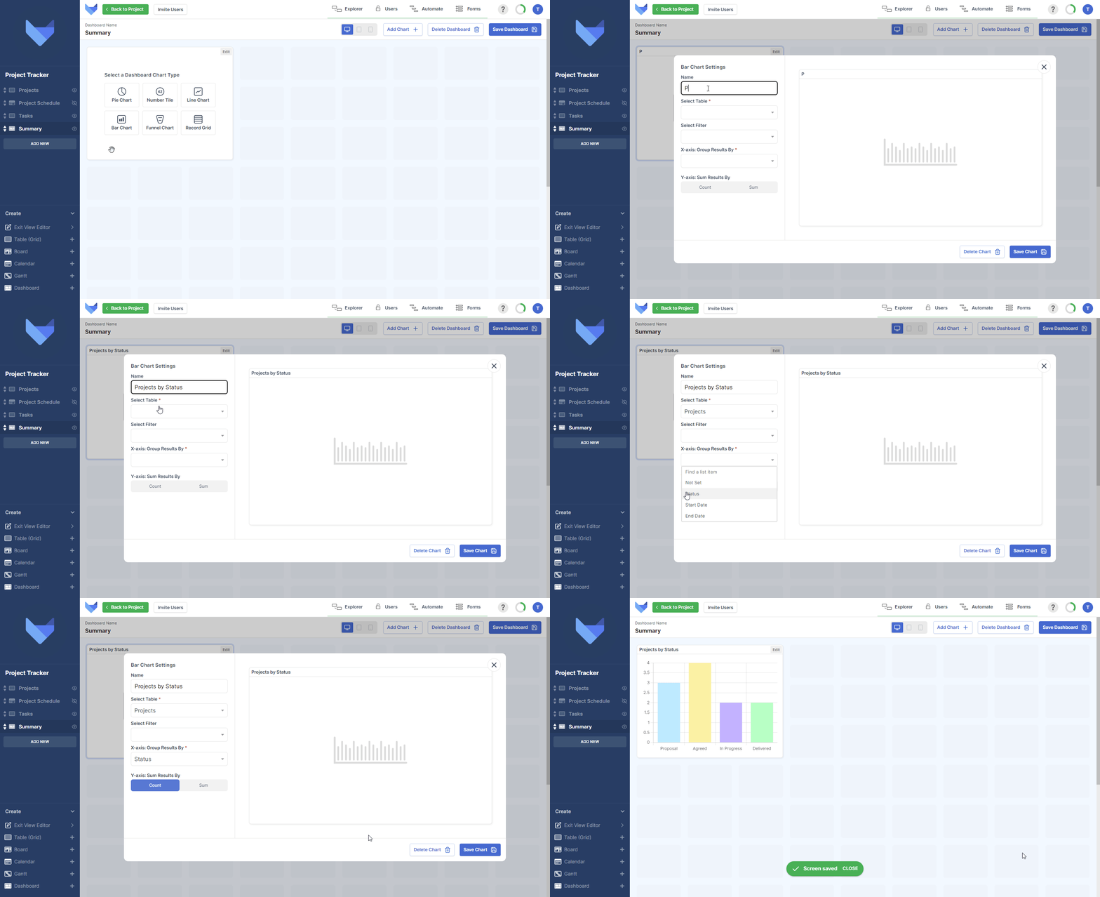
Bar Charts
Bar Charts display data across two axes, showing a bar for each of the x-axis values.
- Enter a Name for the Chart
- Choose which Table the Chart should show data from
- Optionally, select a Saved Filter to show a subset of data on the Chart
- Choose which Field you would like to Group data by on the x-axis of the Chart, where the Field Type must be a List, Date, Date Time, User, User Group or linked Parent
-
Finally, choose how the value of each point is determined in the ‘Sum Results By’ section, where you can choose to from one of the following options:
- Count: Number of Records that match the grouping
- Sum: Total value in a chosen Field for all Records that match the grouping, where the Field chosen is a Number, Money or Formula Field
- Click Save Chart
Funnel Charts
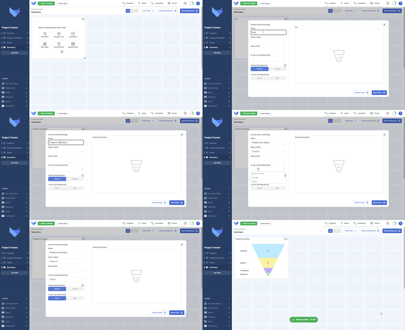
Funnel Charts show a pipeline of data, which can be useful to show sales opportunities or project flows.
- Enter a Name for the Chart
- Choose which Table the Chart should show data from
- Optionally, select a Saved Filter to show a subset of data on the Chart
- Choose which Field you would like to Group data by on the Chart, where the Field Type must be a List, Date, Date Time, User, User Group or linked Parent
-
Choose how you would like the segment values calculated, where depending on the type of data you are choosing to show on the Funnel Chart, you may wish to show a snapshot of the current state of Records or instead show all stages that a Record has been through:
-
Historic: Each wedge in the funnel chart is the total value of the Records which have the specified list value plus all Records with a list value following the specified list value.
This may be useful to see the progress of a marketing campaign where the stages may be Emails Sent, Emails Opened, Meetings Scheduled, Sales Made.
-
Current: Each wedge in the funnel chart it the total value of the Records which match the specified list value.
This option can be used to see a Sales Pipeline where you can see the value of Opportunities in each of the defined Stages.
-
-
Finally, choose how the value of each point is determined in the ‘Sum Results By’ section, where you can choose to from one of the following options:
- Count: Number of Records that match the grouping
- Sum: Total value in a chosen Field for all Records that match the grouping, where the Field chosen is a Number, Money or Formula Field
- Click Save Chart
Note that if the value in a Record is negative then it will be summed with the other Records. If the overall value of a funnel wedge is negative then the negative value will be displayed.
Record Grids
Record Grids show a list of Records from a Table in the Project. You can specify a filter for the data that should be shown, which makes this component useful for showing top priority tasks or high value sales items.
- Enter a Name for the Chart
- Choose which Table the Chart should show data from
- Optionally, select a Saved Filter to show a subset of data on the Chart
- Choose which Fields you would like to display on the Record Grid, noting that you can choose Fields from the select Table as well as Fields from any linked Parent Tables
- Click Save Chart

Updating Dashboards
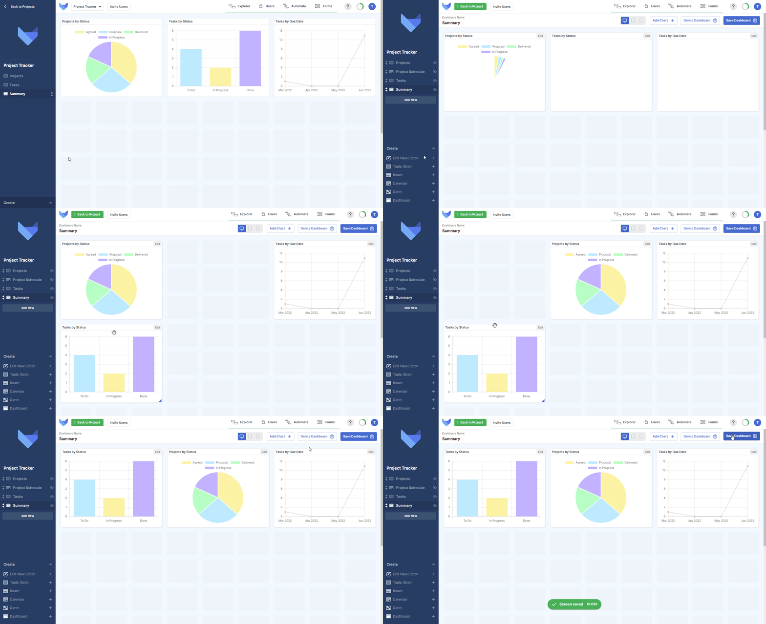
You can make changes to your Dashboard Views at any time. You can choose to add new Charts, amend existing Charts or change the layout of the Dashboard.
- Navigate to the Dashboard
- Open the Create menu in the bottom left hand corner
- Click Edit Current View
- Make the changes to your Dashboard, such as adding a Chart, moving or resizing a Chart, or deleting a Chart
- Click Save Dashboard
Amending an Existing Chart
You can amend the configuration of an existing chart when editing the Dashboard.
- Click Edit in the top right hand corner of the Chart that you would like to amend
- Make the configuration changes that you require
- Click Save Chart

Deleting Dashboards
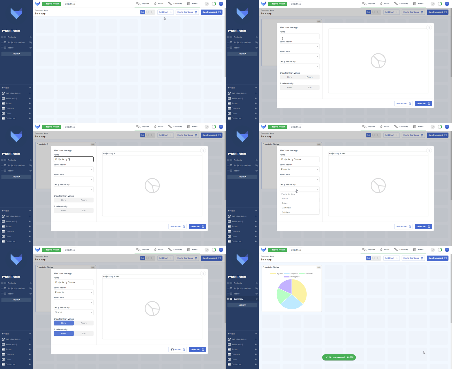
If a Dashboard is no longer required, it can be deleted from your Project. Deleting a Dashboard will remove the View for all your users immediately.
TIP
Deleting a Dashboard cannot be undone. You will have to recreate the View if it is deleted in error.
- Navigate to the Dashboard
- Open the Create menu in the bottom left hand corner
- Click Edit Current View
- Click Delete Dashboard
- Confirm the action by clicking Delete
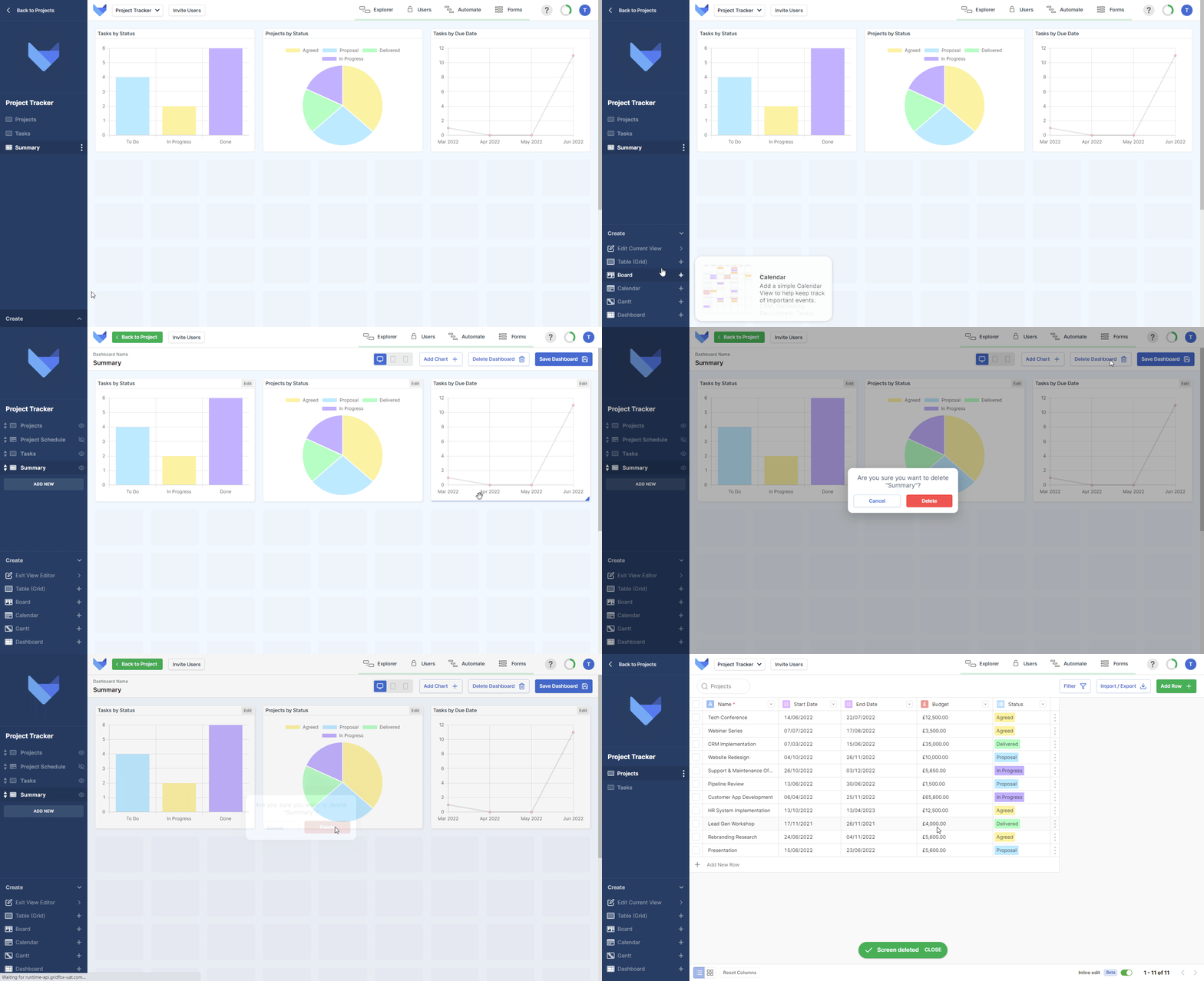
Alternatively you can use the View Menu to delete the Dashboard
- Open the View Menu for the Dashboard
- Click Delete
- Confirm the action by clicking Delete
