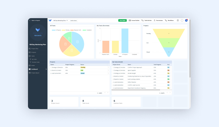
In a world of big data and analytics, data visualisation is essential. For those businesses looking to get a high-level overview of their data for effective decision-making, Gridfox’s dashboard feature provides the perfect solution.
Once you’ve added a few different tables to your project, it can be useful to get an overview of your data. By adding a dashboard in Gridfox, you’ll be able to analyse your data through a variety of dynamic visualisations.
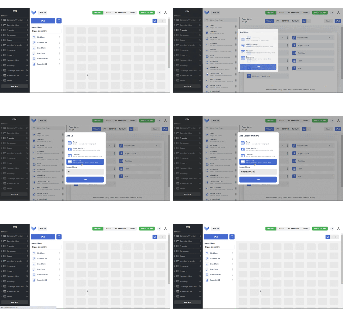
As with many of Gridfox’s key features, you can add dashboards via the screen builder tab at the top right of your project. Select your dashboard from the left navigation bar, give it a name and you’re on your way to visualising project data. What’s more, is that Gridfox supports a variety of chart types — from funnel charts and bar graphs, to number tiles and line charts — on the dashboard tool.

Adding your chosen component is as easy as dragging and dropping this item to a location on your screen. Individual charts can be named, to allow for specific analysis of data. Note, that charts must be linked to a table; this can be selected in the dropdown menu beneath the project title.
Further filters can be applied using any filters that you may have previously saved for your screens. This subset of data can be used on your dashboard rather than all of your project data.
Say you were a retailer using Gridfox as a sales tracker. While your project manages the sales of all the products that your company sells, you might only want to focus on the sales for one specific item. Using the save filter from your tables, you can translate this data into a chart.
Visualising your data in this way helps you make business critical decisions and saves you time when it comes to data analysis. In this instance, your dashboard could help you see whether this product is underperforming with regards to sales, in turn, helping you decide how many units are worth purchasing in the future.
Alternatively, if you’re looking to plan your own work, you might select a filter that covers all tasks that are due in a given week; these would be tasks where their due date equals current week. Depending on the chart that you’re using, you could specify this schedule further by selecting filters across your axis.
In both cases, dashboards give you a dynamic visualisation of your projects data, allowing you to scope out tasks and analyse data effectively.
Using dashboards, our clients have seen the benefits of Gridfox first-hand. The dashboards provide valuable insights, allowing organisations to report on everything from finances to the overall progress of their projects — all in one place.
Want to find out more? Get started with Gridfox for free here.